Retirement Guide
Building an easy, engaging & data-informed retirement planning tool for American citizens
This project was conducted under a Non-Disclosure Agreement, necessitating the modification of client specifics and essential terminology to preserve confidentiality.
In my role as a UX Designer for the project, I contributed to brainstorming and developing several key flows, while also engaging in communication with the on-site Subject Matter Experts (SMEs). These SMEs then showcased our designs to the on-site clients and provided feedback and testing outcomes.
Client
Timeline
3 Months
Services
UI/UX Design
Team
4 Designers
Problem
Client approached our team with the problem of not having detailed information about who their investors are in the defined contribution space.
This is primarily due to the trading and operational mechanisms of Target Date Funds (TDFs) in the United States.
solution
The Applied Design team conducted an extensive market research along with the client, we started out with 14 concepts, decided to create a Retirement guidance portal for plan participants.
Result
70% of end users say they see themselves using this retirement guidance tool over other tools.
Stakeholders
Plan Participants
A step-by-step approach to get you on the right path to a comfortable retirement.
Offering practical retirement guidance, whatever your savings progress may be.
Actionable steps to optimise your assets, and targeted methods to navigate the complex transition into retired life.
Plan Sponsors
Offers a trustworthy service based on the brand’s thought leadership and expertise.
Provides a targeted solution to under-supported and disengaged pre-retirees.
Offers guidance, advice, and investment options that lead to better retirement outcomes.
Client
Promotes the brand.
Increases participant engagement with Retirement Income Services and Advice.
Allows the client to cross-sell different investment securities directly to end-users.
Reinforces client’s leadership position in Target Date Funds.
KEY DESIGN PRINCIPLES
01
Use approachable messaging that reassures and inspires.
Inspire participants forward with encouraging language that motivates and celebrates. Make financial topics accessible by reducing jargon and communicating in a language that is accessible to all audiences.
02
Guide decision-making with timely support when needed.
Help participants progress down the path toward retirement by providing support in moments that feel high-stakes or require financial acumen. Offer varying levels of guidance – in the moment or scheduled – for participants to gain clarity and confidence.
03
Prioritise next-steps to promote progress in the journey.
Encourage participant action by providing the next best step in planning. Help generate and sustain momentum forward with simple, easy- to-complete steps that build on one another. Break larger, long-term goals into smaller, near- term tasks.
DESIGN PROCESS
01
Research and Metrics
Applied design strategies were used to validate the need of a feature or requirement. Metrics and goals were set before kicking of the design.
02
Create Design Concept
Ideas were discussed and created and critiqued. These designs were data- informed and based on learnings from evaluative research.
03
Usability Testing
The ideas are quickly created as concepts and tested with a sample of probable end users in terms of ease of use and utility of the feature.
04
Iteration and Delivery
KEY FEATURES
Retirement Readiness Evaluation
A way to gather user data regarding their financial situation, objectives, and expenditures, aimed at providing a comprehensive overview of retirement planning and identifying areas for potential enhancement.
Scenario Editor
Enables users to change and test various scenarios and see their impact on the retirement plan.
Action Plan
An action plan is a tool that helps users pinpoint areas for improvement in their retirement journey. They can select specific targets, create a plan, and work through it to enhance their retirement experience.
Other Features:
Product Cost Comparison | Glide Path Analysis | Annuities
Let's explore the key features!
01
Retirement Readiness Evaluation
Description
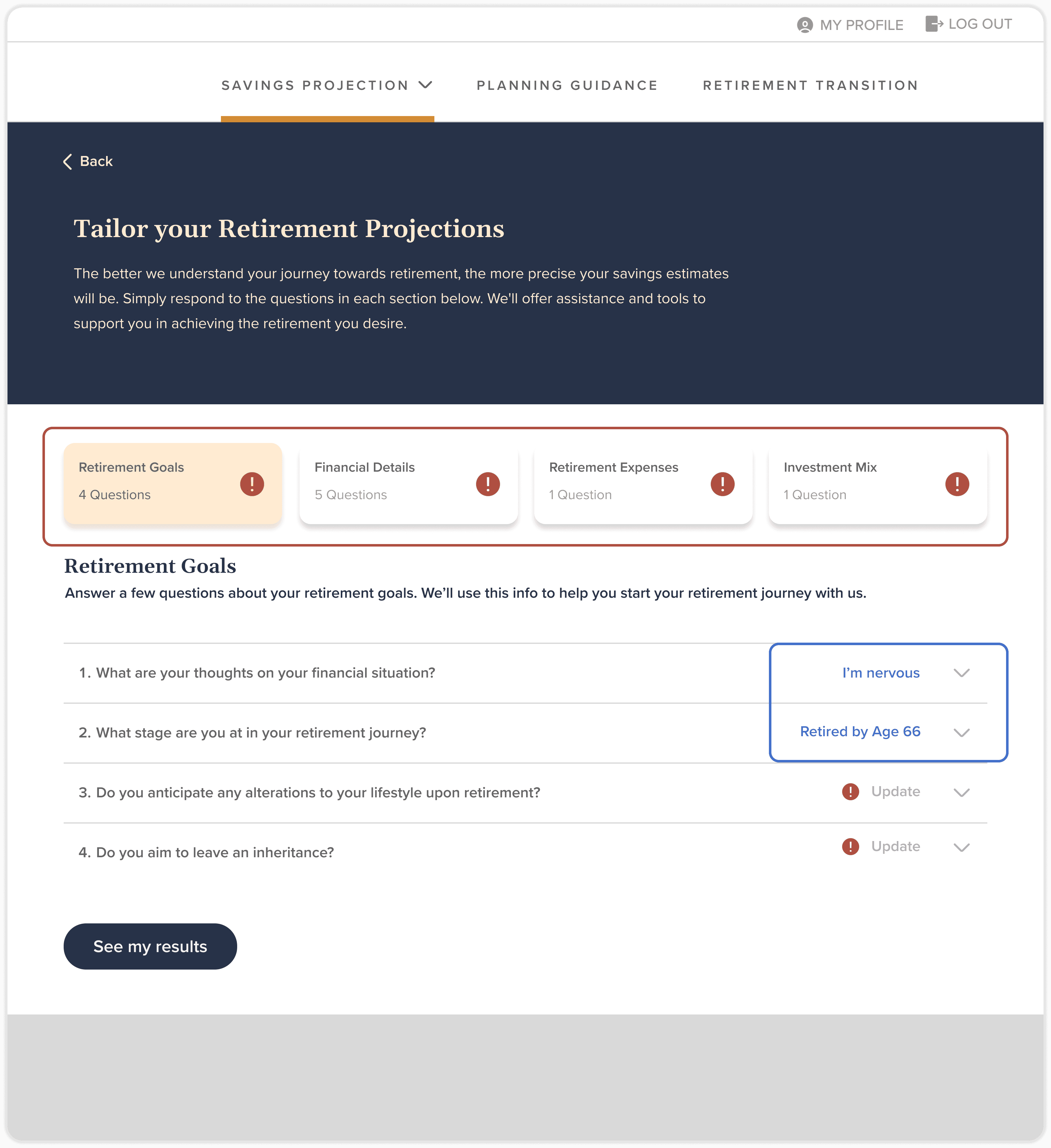
Once the user establishes a profile on the platform, the retirement readiness evaluation gathers further information by prompting the user with questions across four distinct categories: Retirement Goals, Financial Details, Retirement Expenses, and Investment Mix. After the user responds to all the questions, the savings and retirement projection on the dashboard is updated to provide a more accurate depiction, assisting the user in evaluating their retirement plan and pinpointing areas for potential improvement.
Feature overview
Category Segregation
Organising questions into four distinct categories aids users in concentrating on one section at a time, preventing them from feeling overwhelmed by a lengthy list of questions.
Response Overview
Provides users with a glimpse of their response to a particular question, even when the accordion is collapsed.
Simultaneously emphasises sections requiring user updates.
Accordion
Guidance
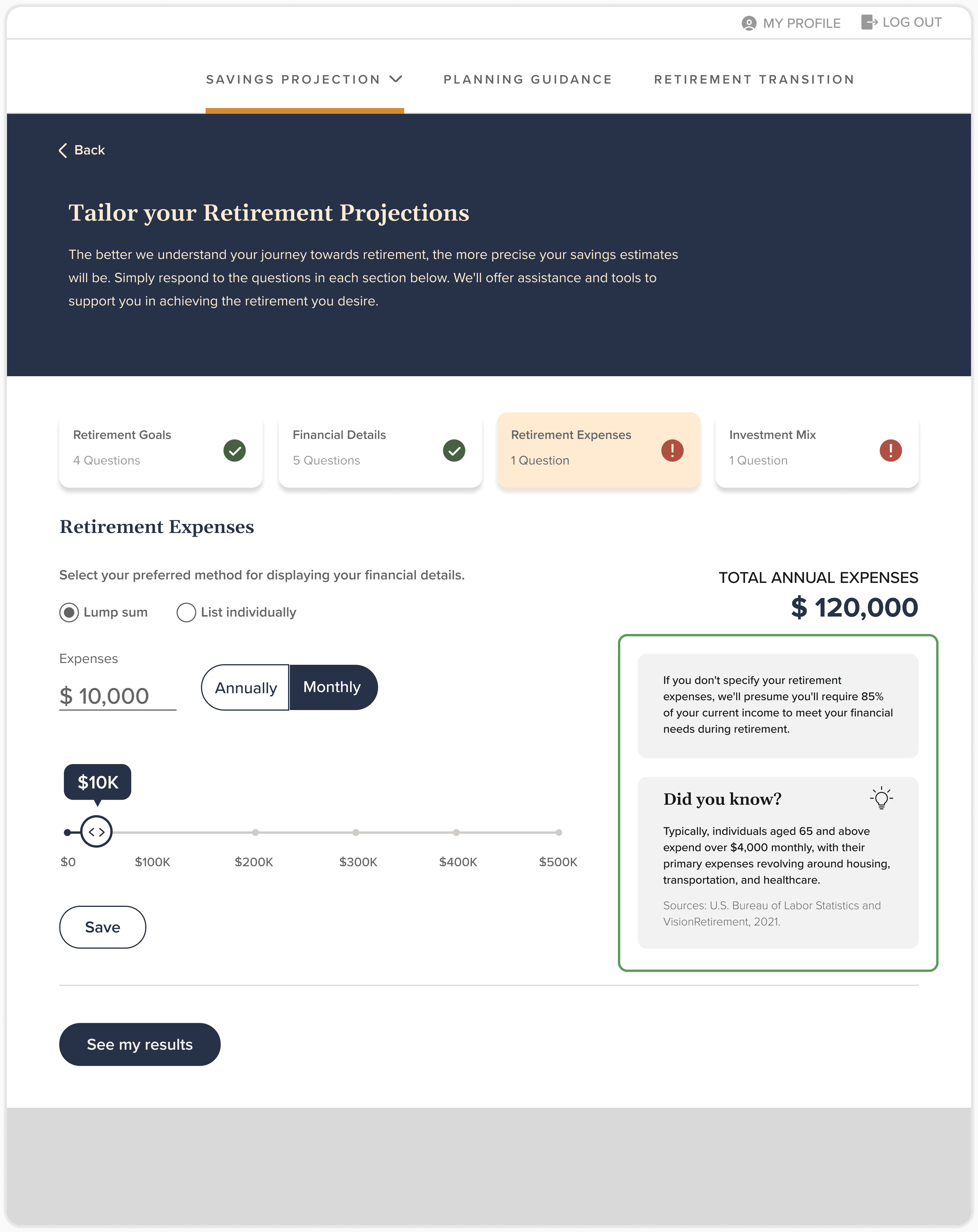
Guidance and information sections assist users in providing input for areas where they may be uncertain about what to enter, while also offering guidance on how the platform may evaluate their information.
This concept has been integrated throughout the tool to ensure a smooth user experience.
RESPONSIVE DESIGN
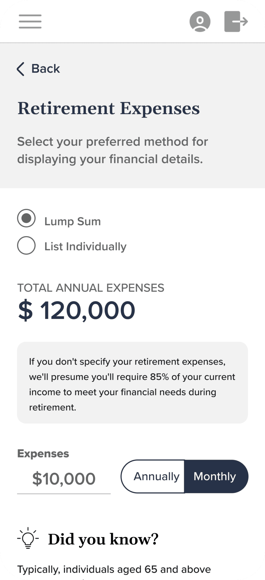
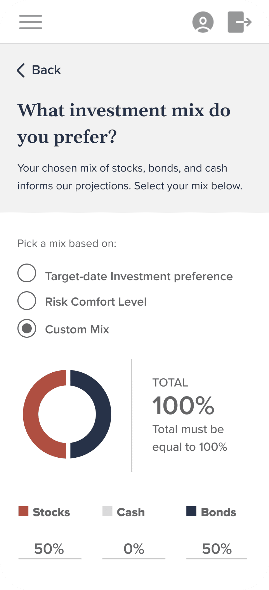
The platform was designed to be mobile-responsive, ensuring that every feature functions seamlessly on both phone screens and other devices, facilitating smooth transitions between them.
TESTING OF THE FEATURE
Extensive testing rounds were undertaken for this feature to guarantee an outstanding user experience. Following the development of an improved version based on multiple testing iterations, three final rounds of testing were conducted to ensure a seamless user experience, focusing on comprehension levels and navigation patterns.
8 Participants
Age: 50+
Has an employer sponsored retirement plan.
Mix of short-term (within 1 to 5 years of retirement) and long-term pre-retirees (within 6 to 10 years of retirement).
PART - I
Reviewing Question Groups
GOAL: Evaluate the usability of the Retirement Readiness Evaluation, specifically focusing on navigation across question groups.
Are users aware of the presence of various question categories to complete or update within the 'Retirement Readiness Evaluation'?
Are users able to grasp the process of moving between question categories?
Will users revisit other questions using navigation, or will they only respond to the currently visible ones?
How do users perceive the ease or difficulty of navigating the interface?
Feedback
Participants quickly noticed and used question categories, either by scanning each one before focusing or starting with the first category and reviewing others later.
Participants found the questionnaire navigation intuitive and user-friendly, with an average rating of 4.75 out of 5. Six participants rated it as very easy (5), while two rated it as easy (4).
PART - II
Financial specifics: degree of detail and time frame
GOAL: Evaluate user understanding and usability following adjustments to the level of detail in questions.
Are users clear on the distinction between "Provide total amounts" and "List each item separately"?
Do users find it intuitive to add individual savings accounts and understand the necessary information needed to complete the task?
Which time interval do users typically choose when entering dollar amounts for their retirement income and expenses? Is it annually or monthly?
Feedback
Participants find it most intuitive to input savings/financial information on an annual basis. When considering expenses, a monthly timeframe proves beneficial to them.
Retirement Readiness Evaluation was viewed as being comprehensive.
A few participants missed where rental income belonged or wanted to see how current financial situations would impact their retirement projections.
Half of the participants mentioned adjusting detail levels in the financial details tab, with uncertainty about "List individually." While "Provide total amounts" was clear, "List each one individually" caused uncertainty, though it made more sense once understood.
The ability to change the level of detail for inputting financial details was seen as helpful for entering spousal information and ensuring accurate projections.
PART - III
Retirement Expenses, Income Sources, and Investment Mix
GOAL: Assess user comprehension & usability when inputting expenses, adding retirement income, & selecting an investment mix.
What enhancements could facilitate participants in inputting retirement expenses more effortlessly?
How do participants conceptualise the timeframe for their retirement expenses? (Using calendar years or ages?)
Besides annuities and pensions, what other significant retirement income sources would participants prefer to include?
To what extent does the format facilitate the input of various retirement income sources?
Do participants grasp the inquiries regarding their current investment mix and how to provide responses? What obstacles do they encounter?
Feedback
Question 3 in the financial details section lacks clarity regarding whether the projected retirement income encompasses retirement account savings.
A majority of participants either could not accurately discern the reason behind being asked to select an investment mix or provided very vague responses.
Participants expect to have additional sources of income during retirement, including part-time jobs, rental property, social security benefits, and their spouse's pension or other income streams.
Many participants found age easier to conceptualise than calendar years, as the latter requires additional mental math. However, when it comes to expenses, opinions were divided: half preferred calendar years for reasons such as short-term and long-term planning, while the other half found age easier to conceptualise.
Out of 8 participants, 7 expressed a preference for being automatically directed to the 'List individually' option for financial details questions and expenses.
02
Scenario Editor
Description
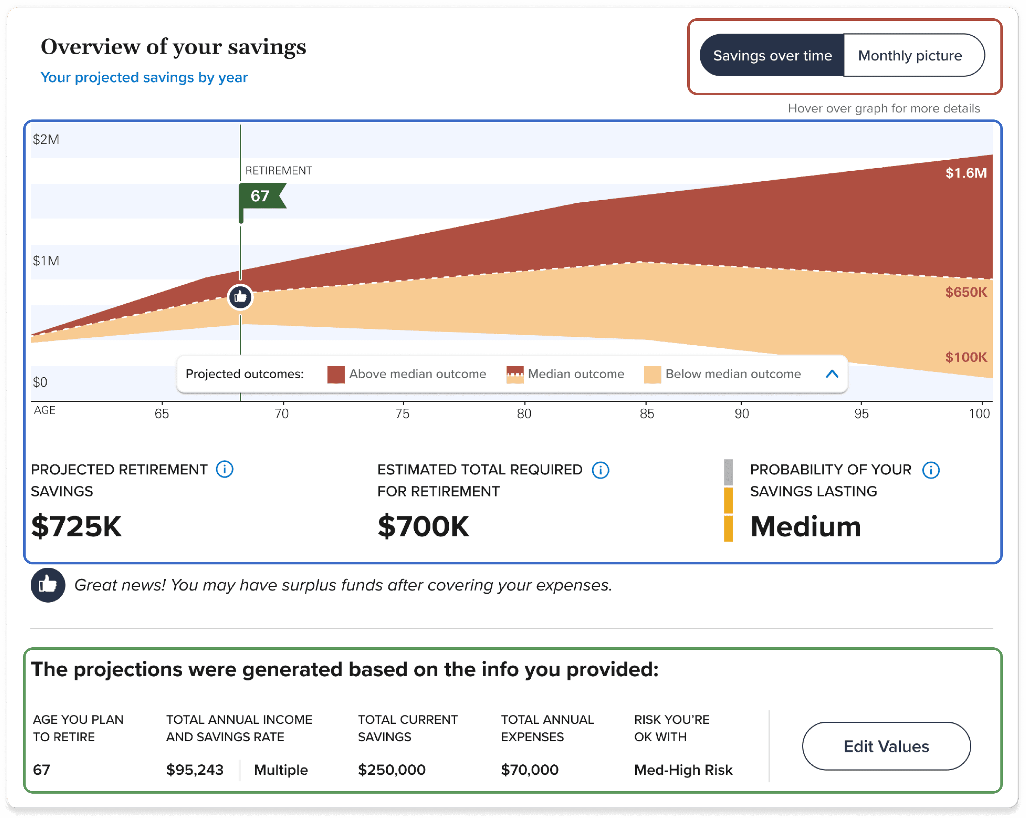
The Scenario Editor widget is integrated into the dashboard's retirement projection graph, offering users insight into their retirement journey. The graph projects their potential savings and requirements based on initial onboarding inputs and retirement readiness evaluations. Users can adjust values directly on the dashboard using Scenario editor, instantly visualising how changes impact projections. This streamlines the process, empowering users to make informed adjustments efficiently.
Feature overview
Monthly vs Overall Picture
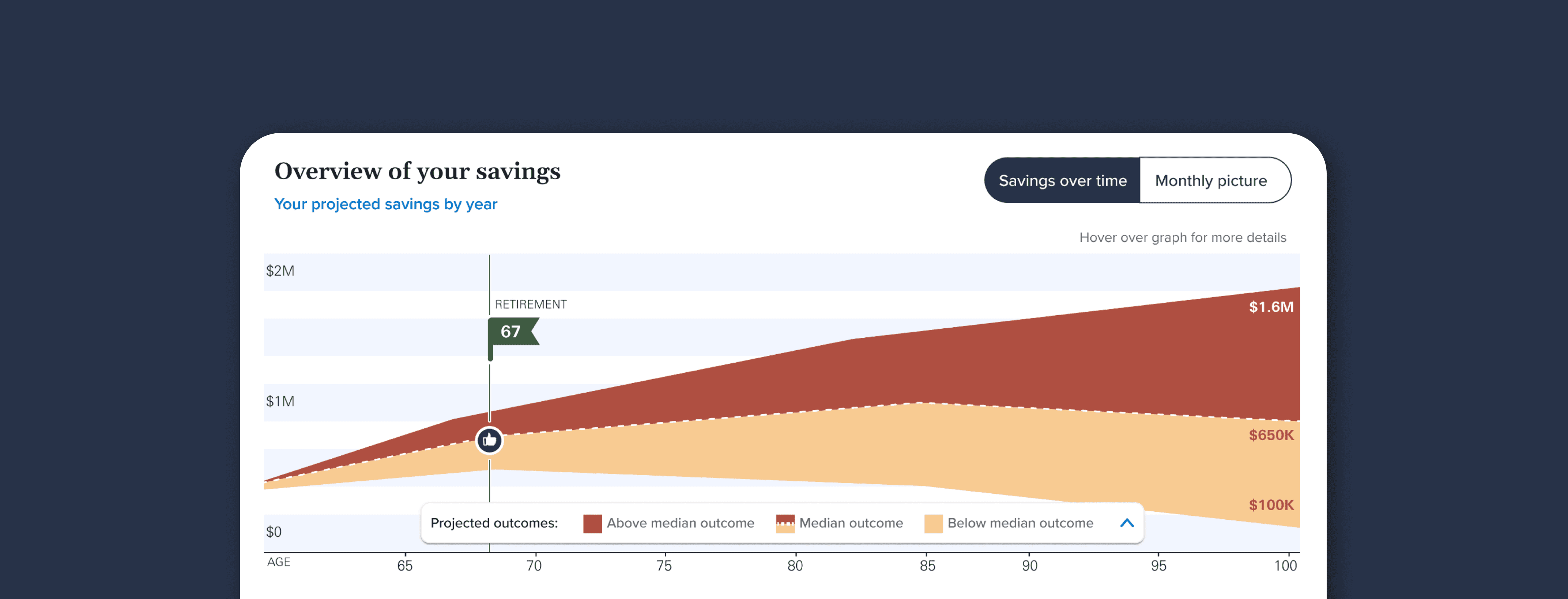
The Savings Over Time and Monthly Picture toggle allows users to effortlessly switch between monthly and comprehensive views of their retirement savings.
Retirement Projection
Utilising the Hurricane graph and projected retirement savings, users gain comprehensive insight into their financial standing throughout retirement.
Information Overview
Users can access their provided basic retirement information here to grasp the factors influencing the projection graph.

Change in Projection
Users can preview the alteration in the retirement projection after adjusting the value here, aiding them in deciding whether to save the change or revert it.
Scenario Editor
In edit values mode, users can conveniently adjust and simulate specific values directly on the dashboard to observe their impact on the retirement projection.
This allows them to assess changes without navigating to the retirement readiness evaluation. If satisfied, users can save the alterations directly from this interface.
RESPONSIVE DESIGN
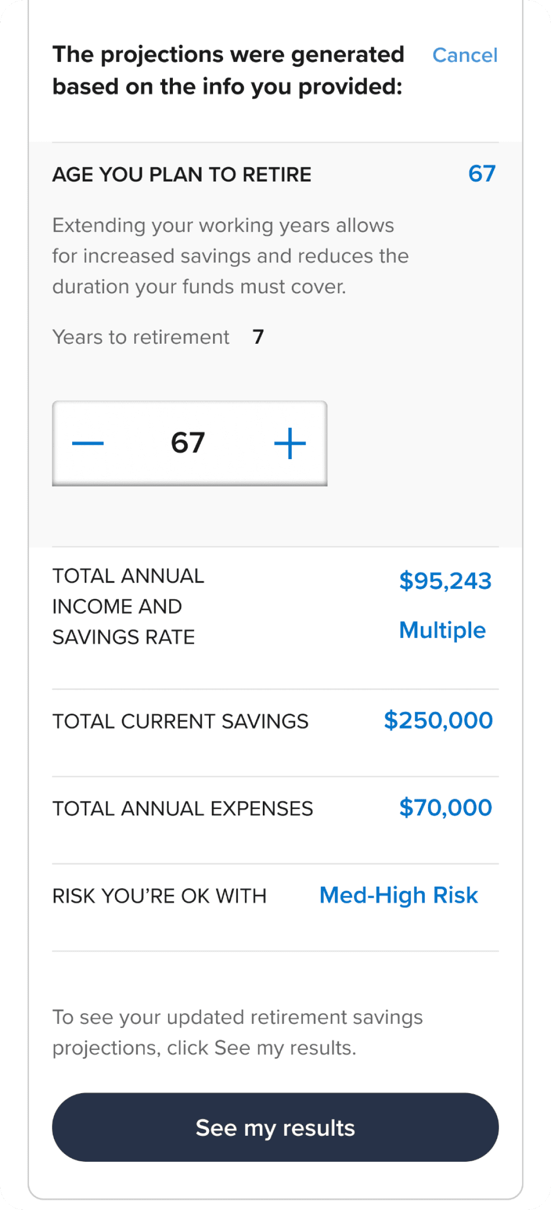
Designing the scenario editor for the mobile version posed some challenges, but we successfully implemented a responsive design. By simplifying the interface, we ensured a seamless user experience.

TESTING OF THE FEATURE
Following the feature's design, we conducted a round of testing and received mostly positive feedback from users. In response, we adjusted the placement and wording of calls-to-action (CTAs), provided additional guidance, and refined the flow to ensure a seamless user experience, as demonstrated above.
9 Participants
Age: 50+
Has an employer sponsored retirement plan.
Varied levels of retirement preparedness and financial knowledge.
Doesn’t currently use a financial advisor
GOAL: We aimed to gauge the comprehensiveness and resonance of the new designs and features in Dashboard 2.0 with participants. Our focus was particularly on their experience and reaction while exploring the new projections graph and scenario editor.
Feedback
Participants had positive reactions towards the ability to adjust the model without having to leave the page.
“The update model is easy to do and I quickly see the results, overall it was really good.”- Dave
"I like this! Messing around with the information. Where I'm at, where I would like to be at. I would do it once a year.” - Malissa
Many users overlooked the option to switch between the Savings Over Time and Monthly Picture, prompting the need for a prompt to navigate between them. Action: The Design team is revising the labelling of the toggle and incorporating space for disclaimer messaging to inform users about what to expect when they toggle views.
03
ACTION PLAN
Description
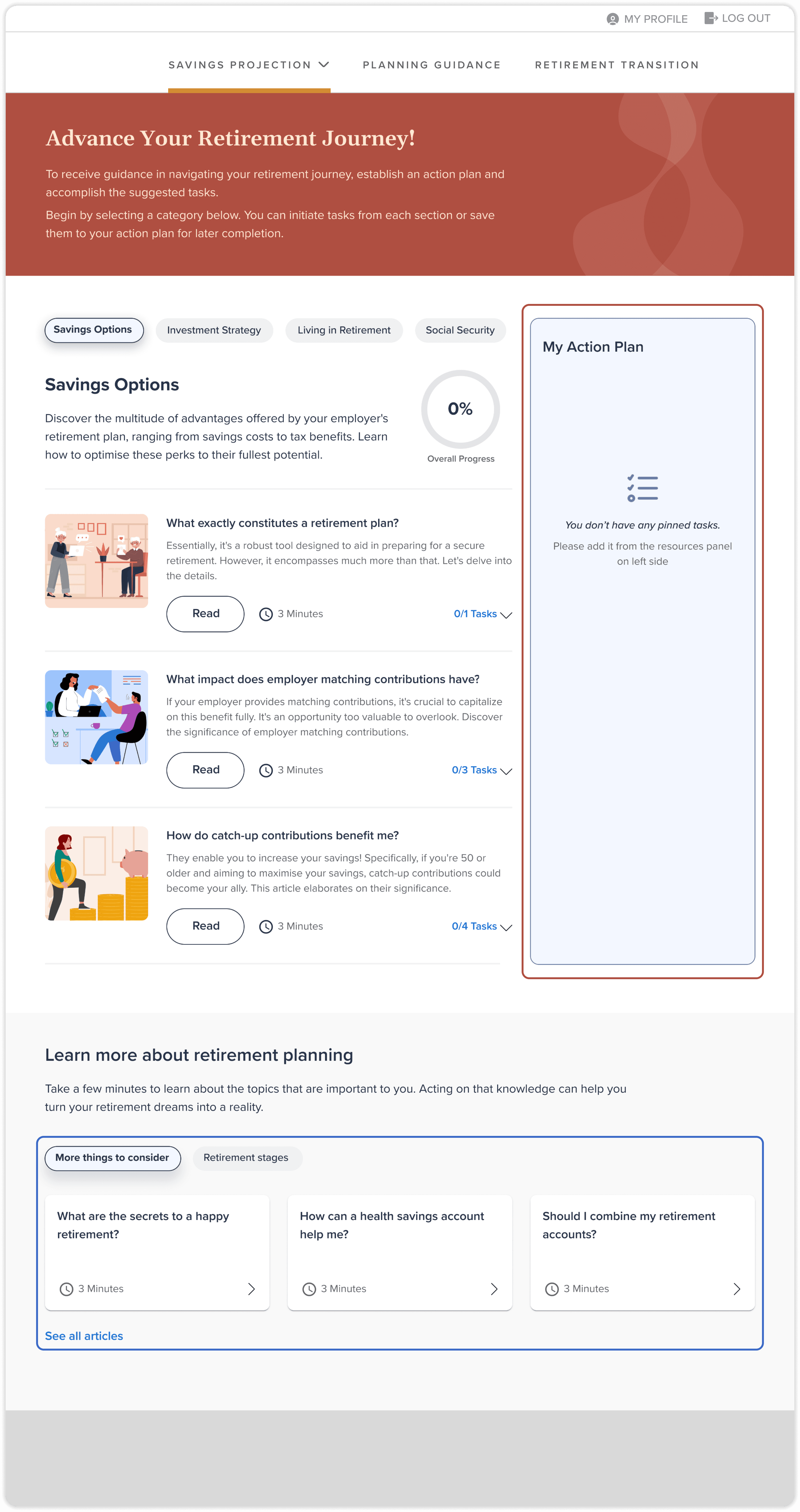
An action plan serves as an educational tool, enabling users to compile a list of objectives aimed at streamlining their retirement process. By autonomously selecting areas within the plan they wish to enhance, individuals can pin specific targets, construct a plan, and systematically progress through it, acquiring the knowledge necessary to enhance their retirement journey.
Feature overview
Personalised Panel
The "My Action Plan" Panel assists users in monitoring all the tasks they've pinned to advance their retirement journey. It allows them to track their progress by marking completed tasks and identifying those still pending.
Additional Articles
The extra articles are positioned directly beneath the user's action plan workspace. This placement ensures that once users finish exploring and scrolling through their action plan, they seamlessly transition to accessing additional reading material available in the articles section of the platform.
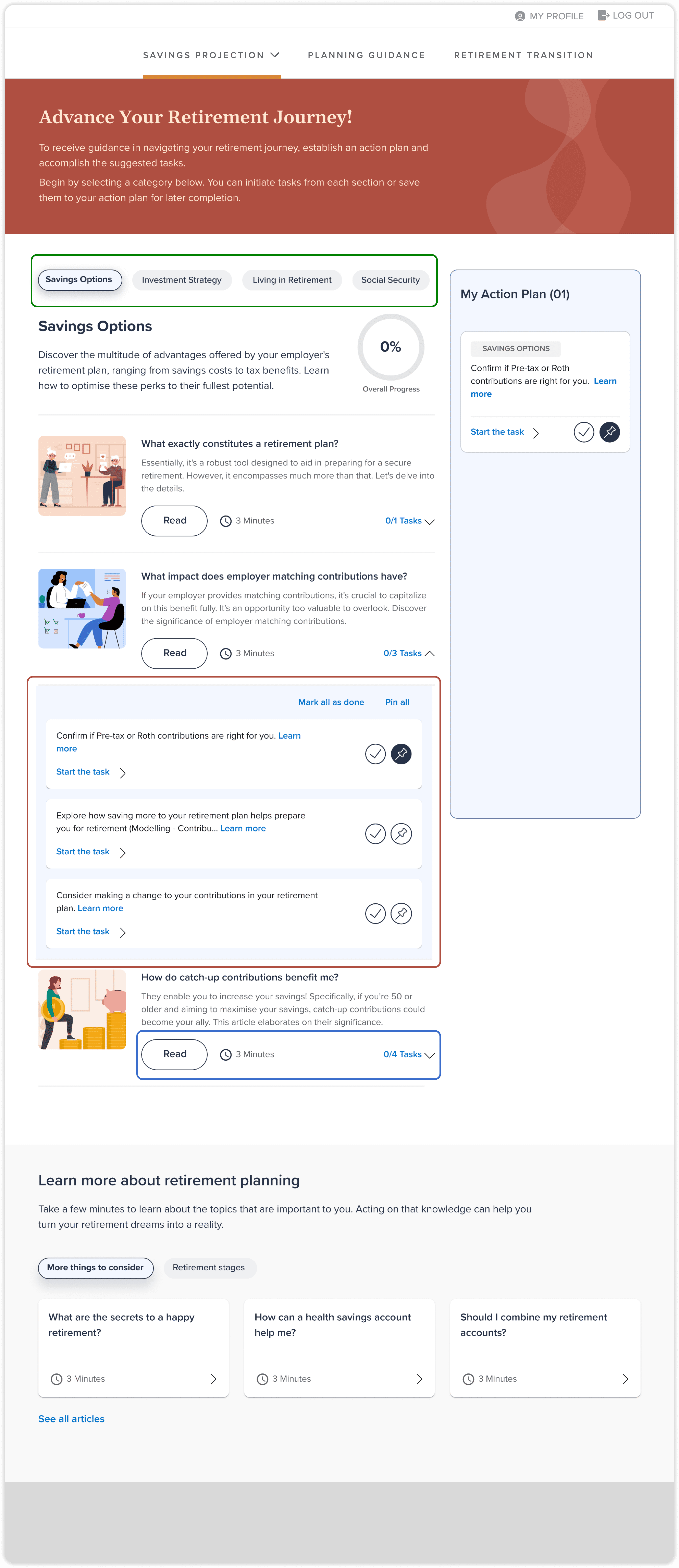
Category Segregation
Organising tasks into various categories assists in presenting the information in a less daunting manner for users, making it more structured and easier to access according to their preferences.
Viewing Tasks
Users have the option to access all the tasks embedded within the explanatory content by expanding the accordion located within each article.
When initiating a task, users are either directed to another page within the product or redirected to a third-party portal, depending on the selected task.
Reading Article
To provide users with context for all listed tasks, an article is generated for each nested category within a main category.
Users can opt to gain knowledge by clicking on the "Read" call-to-action (CTA) button to learn more about a specific area. Additionally, they can access or pin tasks directly from within the article.
RESPONSIVE DESIGN
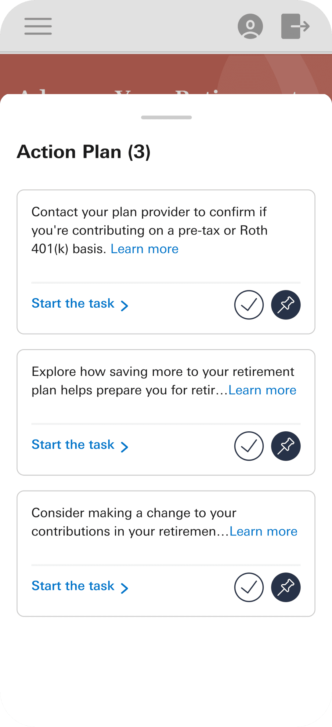
We designed a persistent bottom drawer for the action plan on mobile screens, ensuring users can easily access it throughout their educational journey, providing seamless access to their plan while navigating different sections.

THE IMPACT

The conversion rate of the redesigned homepage improved more than 50x from 0.33% to 19%

All of the features that were designed were rated more than 4 on the scale of 1 to 5.

70% of end users say they see themselves using this retirement guidance tool over other tools.
LOOKING BACK AT THE JOURNEY
LEARNING
User-Centric Design: Developed a keen understanding of prioritising user needs and preferences to enhance satisfaction and engagement, emphasising a user-first approach in the design process.
Iterative Testing: Gained proficiency in identifying and addressing pain points through iterative testing, highlighting the value of continual feedback and refinement.
Stakeholder Communication: Improved skills in effective communication with stakeholders, gaining valuable insights and feedback that shaped the project's design and functionality.
Responsive Design: Mastered the creation of seamless functionality across desktop and mobile platforms, ensuring a consistent and accessible user experience.
Clear Communication: Learned to simplify language and reduce jargon, making complex financial topics more understandable for users and building trust in the tool.
REFLECTION
User Feedback: Positive feedback underscored the importance of designing intuitive, interactive elements, reinforcing the value of user-centred design.
Detail Adjustments: Recognised the necessity of providing clear instructions for complex inputs to enhance user comprehension.
Labelling and Instructions: Clear labels and instructions were identified as crucial for significantly improving the user experience and preventing confusion.
User Preferences: Adapting to user preferences demonstrated how to make tools more intuitive and user-friendly.
Comprehensive Planning: The success of the project highlighted the importance of thorough planning and goal-setting, ensuring objectives were met efficiently.
